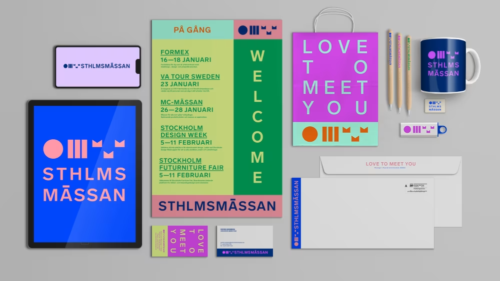
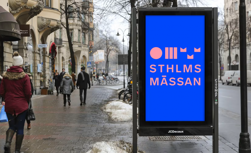
The new visual identity has been revealed for Stockholmsmässan, Sweden’s largest conference and exhibition centre.
Aiming to create vibrant designs with a variation in colour and form, the agency Brand Union was commissioned pre-pandemic to review Stockholmsmässan's graphic profile to better market itself as a European MICE destination.
“We created a new positioning, brand promise, graphic identity, and a completely new logo for Stockholmsmässan,” says Jonas Andersson, CEO of Brand Union.
“The work was based on numerous interviews with employees and stakeholders, as well as a great environmental analysis.”

Brand Union and Stockholmsmässan have explained that the brand palette symbolises the flexibility and possibilities the destination offers MICE groups. The new logo is designed to modernise the brand and fit digital formats.
“Our visual identity for Stockholmsmässan should, just like our facility, be lively and dynamic, with great freedom and variation,” adds Patrik Svanberg, Creative Director at Stockholmsmässan.
“We are also extremely pleased that the Swedish Patent and Registration Office approved the modern form of the crown (in the logo), as it is difficult to obtain permission to use the three crowns in a logo. It is a strong symbol for both Stockholm and Sweden, but also for us.”
The rebrand is aligned with the start of a new year, as Stockholmsmässan is preparing to receive 800,000 Swedish and international visitors at its 2024 events.


