
Website specialists ASP reveals how conversion rate optimisation can give you a competitive edge in the online marketplace.
Did you know that conversion rate optimisation (CRO) can help event organisers improve their cost per visitor and get a better return on PPC while converting more web traffic into leads, sales and registrations?
Here is our lowdown of how you can make the most out of your event website.
What is CRO?
The purpose of CRO is to improve the likelihood of visitors taking a desired action on a webpage. This typically involves A/B testing elements like colour, wording, content and navigational elements of your website to see what gets the best results.
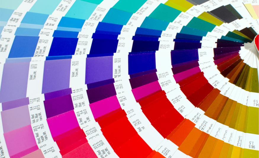
True colours
In a recent A/B testing we carried out with Informa Tech’s Ai Summit, we found that if the organiser changed their CTA button from black to orange, they would get over a 25% increase of visitors clicking through to their ticketing page. A massive uplift.
What colour is right for your show? While high-contrast colours will pop, low-contrast analogous colours (ones with a more subtle tonal change) may prove more eye-catching.
The only way of really knowing is by using an event marketer’s secret weapon; conversion rate optimisation (CRO).
Picture perfect - subliminal stimuli
We often make decisions in our everyday lives because of subliminal stimuli. When it comes to events, how many times have you gone onto a show website and seen an image of a busy bustling show floor?
But ask yourself this; is it a good image to make someone want to go to your trade show? For an exhibitor, the likely subliminal message they receive from this picture is big crowds = a successful show. However, for a visitor, an image of exciting show floor content is more likely to subliminally make them more eager to buy that ticket and attend.
UX appeal
At ASP, our research on UX found that potential visitors make up their mind on whether they like that show or not in 2.6 seconds. Clearly first impressions count. Potential visitors and exhibitors demand an easy, efficient, and fast user experience of your event website. Therefore, good UX is a key cornerstone to converting web traffic into money on the bottom line.
Use the Gutenberg Diagram
The Gutenberg Diagram is a visualisation of how Latin-alphabet readers — those of us who read from left-to-right, top-to-bottom, process information presented on a webpage.
The theory is that, on average, most of us start looking at a website page from the top left and move right and then zig down. This creates an uneven distribution of attention on certain parts of the page, meaning some areas hold more value.
Gutenberg divides the page into quadrants. Readers spend the most time looking at the top-left and bottom-right. For better conversion, we recommend putting your logo and key information in the top left of the page and then using the bottom or top right for your CTA.
Remember, if your show is based in the Middle East, your audience will mostly use the Arabic Alphabet, so the Gutenberg Diagram is reversed.


